Enhancing Healthprofit’s
UX and Clarity
Enhancing Healthprofit’s
UX and Clarity
Optimizing the website to better guide users toward posture correction programs.
Optimizing the website to better guide users toward posture correction programs.


A Taiwan-based startup focused on posture correction and body alignment, with an emphasis on leg correction. The website needed improved UX across all devices.
Ensuro is a blockchain-based, licensed (re)insurance company that aims to make insurance more accessible to the public, allowing anyone to invest in insurance risk and benefit from it.
My experience as an Ensuro user informed my design decisions
This solo project, part of my DesignLab bootcamp, involved designing and adding a new feature to the Ensuro website. I handled everything from identifying the problem to UX research, visual design, and prototyping.
Role
Role
UX/UI Designer
UX/UI Designer
Goal
Goal
Optimize the desktop experience with improved readability, clear CTAs, and simplified navigation.
To improve the user experience by creating a dashboard for better investment tracking
Problem
Problem
Lack of responsiveness on desktop devices and repetitive content on the homepage
Lack of responsiveness on desktop devices and repetitive content on the homepage
Tool
Tool
Figma, Framer, Notion, Google Docs, Cloudflare
Figma, Framer, Notion, Google Docs, Cloudflare
USER INTERVIEWS
USER INTERVIEWS
I interviewed 7 individuals with established fitness routines to understand their preferences, motivations, and challenges related to posture correction. Their insights reveal key opportunities for Healthprofit to address user needs in the fitness space.
I interviewed 7 individuals with established fitness routines to understand their preferences, motivations, and challenges related to posture correction. Their insights reveal key opportunities for Healthprofit to address user needs in the fitness space.


What I Learned from 7 Fitness Users
What I Learned from 7 Fitness Users
What I Learned from 7 Fitness Users
Users prefer personalized and engaging fitness experiences
Active individuals favor in-person and one-on-one coaching for a tailored, motivating experience.
Posture correction benefits are not well understood
Many users see posture correction as irrelevant to their fitness goals without clear benefits communicated.
Cost is a major barrier
Financial constraints often prevent users from exploring additional fitness services like posture correction programs.
Flexibility is highly valued
Users seek hybrid solutions, online programs for convenience, in-person sessions for more challenging exercises.
Personas
Personas
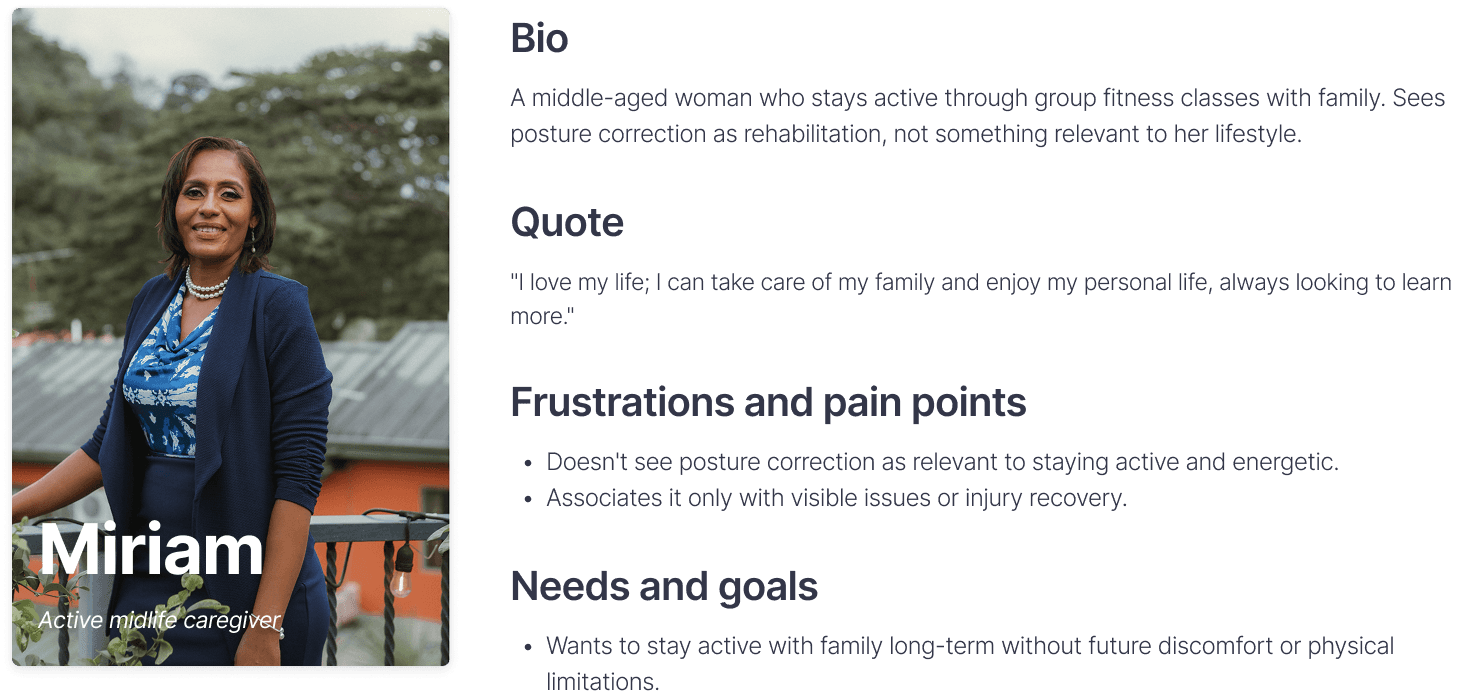
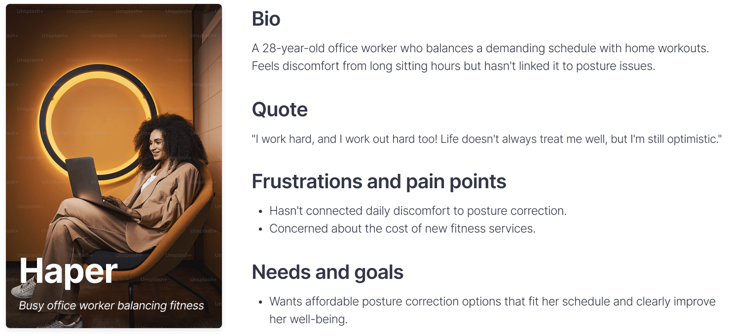
Each persona reflects a real user who might visit the Healthprofit website, grounded in the research findings rather than generic fitness profiles. This helps identify where the current website loses potential users before they convert.
Each persona reflects a real user who might visit the Healthprofit website, grounded in the research findings rather than generic fitness profiles. This helps identify where the current website loses potential users before they convert.

User flow
User flow
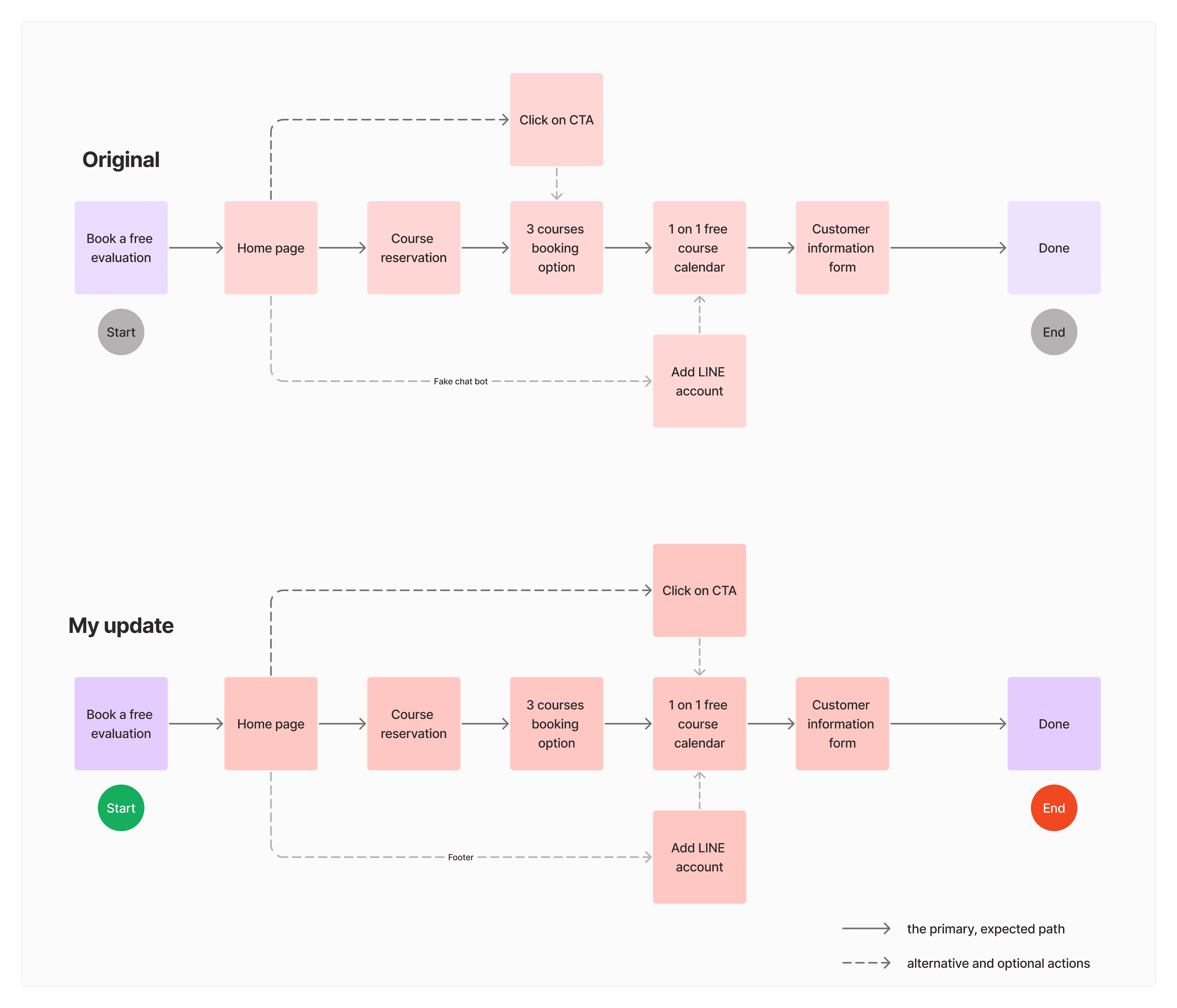
I mapped the current website's user flow, then identified steps that needed improvement. The revised flow is shown alongside the original for comparison.
I mapped the current website's user flow, then identified steps that needed improvement. The revised flow is shown alongside the original for comparison.

User Testing
User Testing
Tasks focused on finding coaches, exploring case studies, understanding program pricing, and booking a free evaluation.
Tasks focused on finding coaches, exploring case studies, understanding program pricing, and booking a free evaluation.
Positive Feedback:
Positive Feedback:
Visually engaging with well-organized content.
Illustrations effectively explain posture issues.
Case study section encourages exploration.
Program listing is clear and easy to navigate.
Visually engaging with well-organized content.
Illustrations effectively explain posture issues.
Case study section encourages exploration.
Program listing is clear and easy to navigate.
Areas for Improvement:
Areas for Improvement:
Color scheme feels flat, making key sections like "Our Team" harder to notice.
"Find Coach" wording is unclear; users expected "Find the Team."
Program section needs a filter feature to find relevant programs quickly.
CTA "Book a Free Evaluation" should be simplified to "Free Trial" for clarity.
Doctor session section feels disconnected from the homepage flow.
Homepage problem–solution structure needs clearer logic.
Some photos feel intimidating, giving a less inclusive first impression.
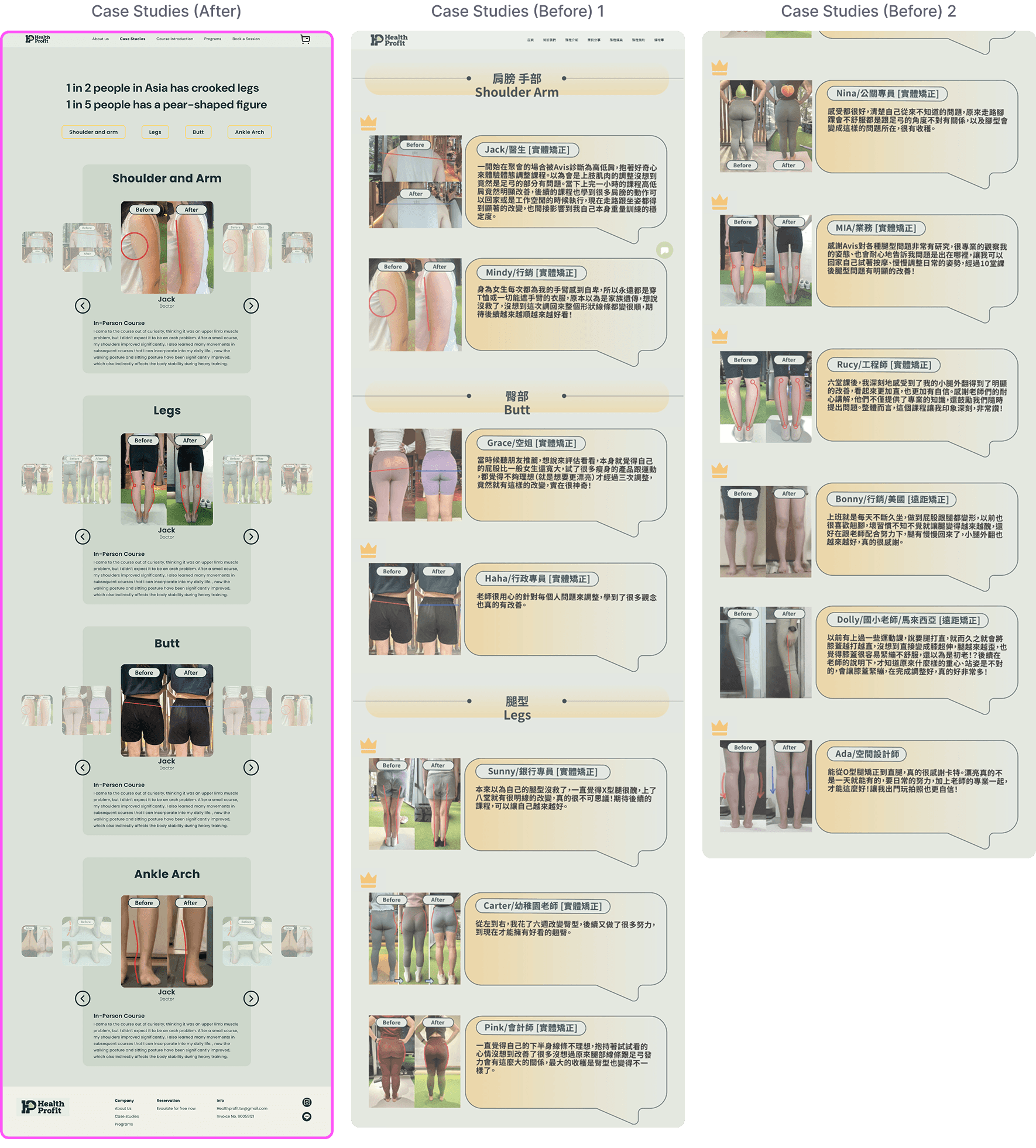
Before After key screens
Before After key screens
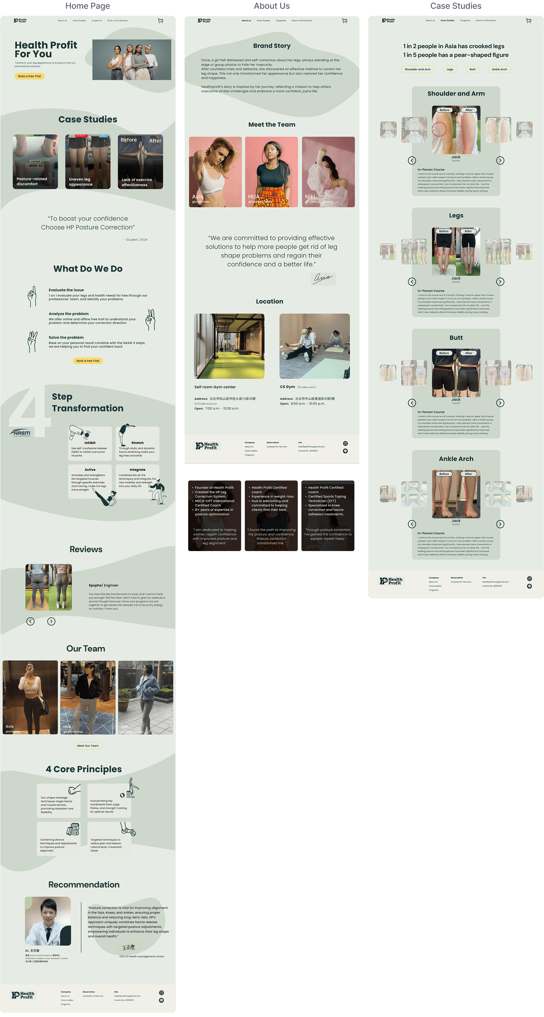
I redesigned the Home, About Us, Case Studies, and Program pages.
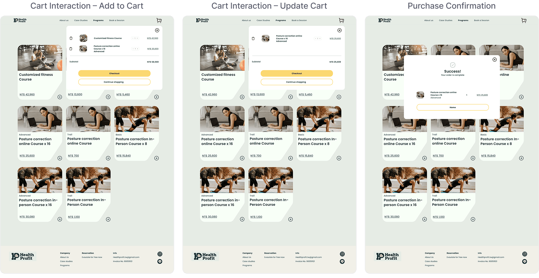
To simplify navigation, I merged the Course Introduction into the Program details.
The Home page was streamlined by removing repetitive content and replacing illustrations with real case studies.
I redesigned the Home, About Us, Case Studies, and Program pages.
To simplify navigation, I merged the Course Introduction into the Program details.
The Home page was streamlined by removing repetitive content and replacing illustrations with real case studies.




Final Screens - Desktop
Final Screens - Desktop
The redesigned desktop screens across the Home, About Us, Case Studies, and Program pages.
The redesigned desktop screens across the Home, About Us, Case Studies, and Program pages.



Final High-Fidelity Prototype
Final High-Fidelity Prototype
The prototype demonstrates the redesigned desktop experience, including improved navigation, clearer CTAs, and a streamlined homepage flow.
The prototype demonstrates the redesigned desktop experience, including improved navigation, clearer CTAs, and a streamlined homepage flow.
Impact and Reflection
Impact and Reflection
This project strengthened my ability to identify where a website loses users before they convert. By focusing on wording clarity, visual hierarchy, and content structure, I helped Healthprofit present their services more clearly to a broader audience, not just the existing clients.
The biggest learning was understanding how much small language changes, like renaming 'Book a Free Evaluation' to 'Free Trial', can lower the barrier for new users and how the right words can make a complex service feel accessible and approachable.
